Tuesday 29 November 2011

The Schools Contents Page

First I started by planning out my contents page and how I would like the whole of my magazine to look by making a flat plan for my magazine.
Here is what I have done so far on my flat plan:

I have added more to my flatplan this is what I have added.


Thursday 24 November 2011

Analysing a magazine contents page


Here is an anotated contents page I have analysed it and asked myself some what and why questions. 


Here i have compared two different contents pages and found the similarites and differences.


Here I have looked at what the contents pages have in common and I have also looked at the differences.


Here I answered some questions about the conventions of a contents page and ways in which a contentsd page can stand out from the crowd.


Thursday 17 November 2011

The Music Magazine Cover

I decided to start my magazine again because I didn't feel my magazine looked very professional. First I decided to use a font that looked more professional and stands out more. Here is what my masthead looks like.


Then I added a new banner which says 'The UK's Number 1. Mag for girls who love Chart Music!' here is what it looks like with it on the magazine.


Then I got a picture of a bar code and cropped it so it would fit it was thinner and would fit better on my magazine. Here is what it looks like with the bar code on.


Then I added the issue number, price and date onto the magazine. This is what it looks like now.


Then I added a true life stories section. Also I added win tickets to Katy Perry etc. Then I added 'exclusive interview with the new star Lauren' for when I add the picture. Here is what it looks like now.


Tuesday 15 November 2011

The Music Magazine Cover (First Draft)

First Draft

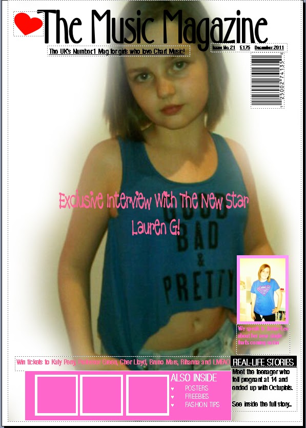
The first thing that I did to my magazine is I decided what colour theme I would like to run throughout my magazine which is Pink. The reason I have chosen pink is because I am doing my magazine on Pop music and I think that the colour pink will work well with the magazine because the target audience of my magazine is girls age 12 and above. So first I added a pink border round my magazine cover, see below what it looks like.

Then the next thing I did was add my masthead onto the magazine. The colour of the title is pink as the only colours that I will be using throughout my magazine cover will be different types of pink. The title I have decided to use is catchy and plain but it will grab the readers attention. See below what it looks like with the added masthead.

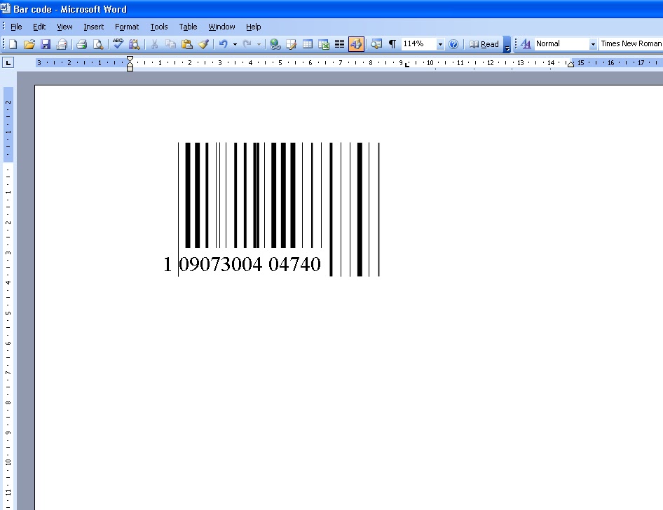
The next thing I did was make the bar code for my magazine as this magazine will have a price unlike my other one. I made the bar code on Microsoft Word, below is a screenshot of when I was making it.
I went on Google and I looked at different bar codes and then came up with my own design, below is a finished screenshot of my barcode.

After that I added the barcode onto the front cover. Above the barcode I added the price of the magazine and what issue this magazine is see below my barcode on the front cover.

Then I added the website for my online version of my magazine. I also added the date of the magazine when its out and when its finshed. See below it added onto my magazine.


Then after that I added a slogan onto the front cover. The reason I used that as my slogan is because it tells you what the magazine is about. See below my magazine with the slogan.


The next thing I did was add in an advertisement. The advertisement was 'win tickets to Katy Perry'. The reason I used Katy Perry is because I have seen her a lot lately on front covers of magazines and I like her music and quite a lot of young people do aswell.


After I had done this I decided that I wanted to change the way I was doing my magazine because it didn't look real it looked a bit basic. So I started to do another magazine, but with the same theme pink etc.

Friday 4 November 2011

4th November 2011

I changed the text in the boxes as there was too much writing on them. I changed them so that there was only about one sentence as the tag line. Also I added the month that the magazine is going to be published in. Also I made the masthead of the magazine so that it is bolder and stands out.

Thursday 3 November 2011

3rd November 2011

I removed all of the yellow boxes as I realised that magazines don't have boxes around everything. I changed the font colour to white as it stands out and looks more appealing. I changed feature story two, because I didn't have a picture from the trip, so I added a recent trip/hike that me and my Duke Of Edinburgh group took. I also changed the colour of the website address and the free sign as it white just makes everything stand out a lot clearer. I changed the tagline box so that the outline of the box is blue so it matches the colour of Shirey High School, also I turned it to the side to add more of an appealing effect.

See below my nearly finished magazine cover


Wednesday 2 November 2011

2nd November 2011

I added some of the feature stories onto my magazine. The first feature story that I added is about the Head Boy and Head Girl. The second feature story is about the Fryland Trip. Then I added an advertisement about the comments page which will come later in the magazine. Then I added a rhetorical question so that the readers have something to think about and something to vote for. Also I added the picture of my head boy and head girl of the magazine.

See below my almost complete front cover